01 Mar When Pop-Ups Can Work For You
 Have you ever been browsing a website, only to have a little windows appear in front or on top of the main page? If so, you’ve encountered a pop-up – and more and more companies are using them on their websites. Love them or hate them, they are designed to get some sort of response or information from the customer before allowing you to return to the main website. While many people claim to hate them, pop-ups actually have a very high conversion rate if they are designed well and timed correctly. Let’s look at some ideas for best practices in using pop-ups so you can decide if they’re something you want to add to your company’s web presence.
Pop-Ups, Perfected
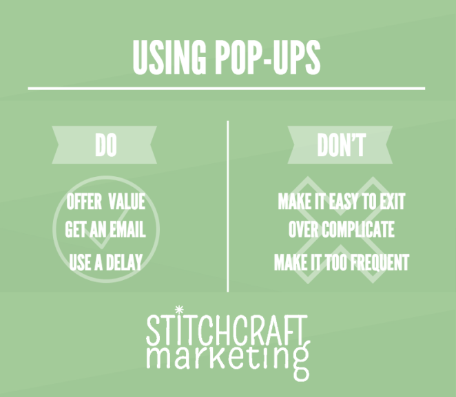
A good pop-up contains a call to action; at the very least, you want to capture your customer’s email address and add it to your subscription list so that you have a way of interacting with them in the future. The question is how and when during a visit to your website should that pop-up appear? At the wrong time, you risk annoying the visitor to your website; at the right time, you convert them from a transient visitor into a potential customer.
Think about your own experience with pop-ups. I know I hate it when they appear right after I’ve arrived on the landing page: give me a chance to look around a little and see if I’m even interested in what you have to offer before trying to get to me to sign up for your email list! Most industry experts now recommend delaying your subscription pop-up until your website visitor is at least two pages deep into your website or after they have browsed for at least one minute.
You also want to make sure that your pop-ups aren’t repetitive. Using cookies can ensure that each individual customer is not bombarded with pop-ups every time they visit your website; if they signed up the first time, great. If they didn’t, delaying the appearance of the pop-up until their third or fourth return to your website makes it seem like more of an invitation. You can play a little hard-to-get!
Pop-ups work best when they offer the potential customer a tangible benefit in return for taking action. Depending on your business, you may want to offer content in the form of a free pattern, ebook or whitepaper, or a discount on a product order. In return, you’ve created an ongoing relationship with that customer. Another compelling piece of information to include in your pop-up might be some social media stats such as the number of Facebook Likes or Twitter followers. Interestingly enough, customers want to feel that they’re signing up with a recognized leader in your particular field, and a large number of likes or follows can instill confidence that you are a popular source for inspiration and information.
If your website is an e-commerce site, consider using a pop-up to upsell during your check-out process. Having related products appear, especially if there’s a special deal on them, makes it easy for the customer to add them to the shopping cart. There’s implicit free advice in such a pop-up: to optimize the experience with product x, most people find product y helpful.
Exit pop-ups are timed to appear when a visitor is about to leave your website. Their content can be customized to create a compelling reason to stay on your page. Again, some kind of an offer may get them to stick around; another possibility is redirecting them to information from a different part of your website that they haven’t visited yet. The idea is that you want to recapture their attention before you lose them completely.

Pop-Ups to Avoid
When using pop-ups, one goal should be to avoid irritating potential customers. As noted above, timing is critical: give them a chance to discover that they want to join your email list – they will be more likely to actually do so when presented with the opportunity.
Don’t put too much information on your pop-up – instead, keep it simple, clear and direct. A catchy headline, a call to action and perhaps a little personality at the end should be on your list; if you are soliciting newsletter signups, you can also include a promise to never sell their email address. This is one place where limiting yourself to clear, compelling text rather than distracting with images may make sense.
Finally, make the way to close your pop-up absolutely clear. A big red X button in the upper right-hand corner lets your customer get on with the process of exploring your website. Also keep in mind that the pop-up doesn’t have to be the only way to engage with them: good content and call to action opportunities embedded in your website puts control back in the customer’s hands, which is the right approach for some people. It’s this combination that helps your business reach a larger audience.
If you need help with adding pop-ups to your website, or with any e-marketing strategies for your craft business, contact us today. We can help you take your website to the next level.


No Comments